Working with fields
Last updated: 2026-03-18
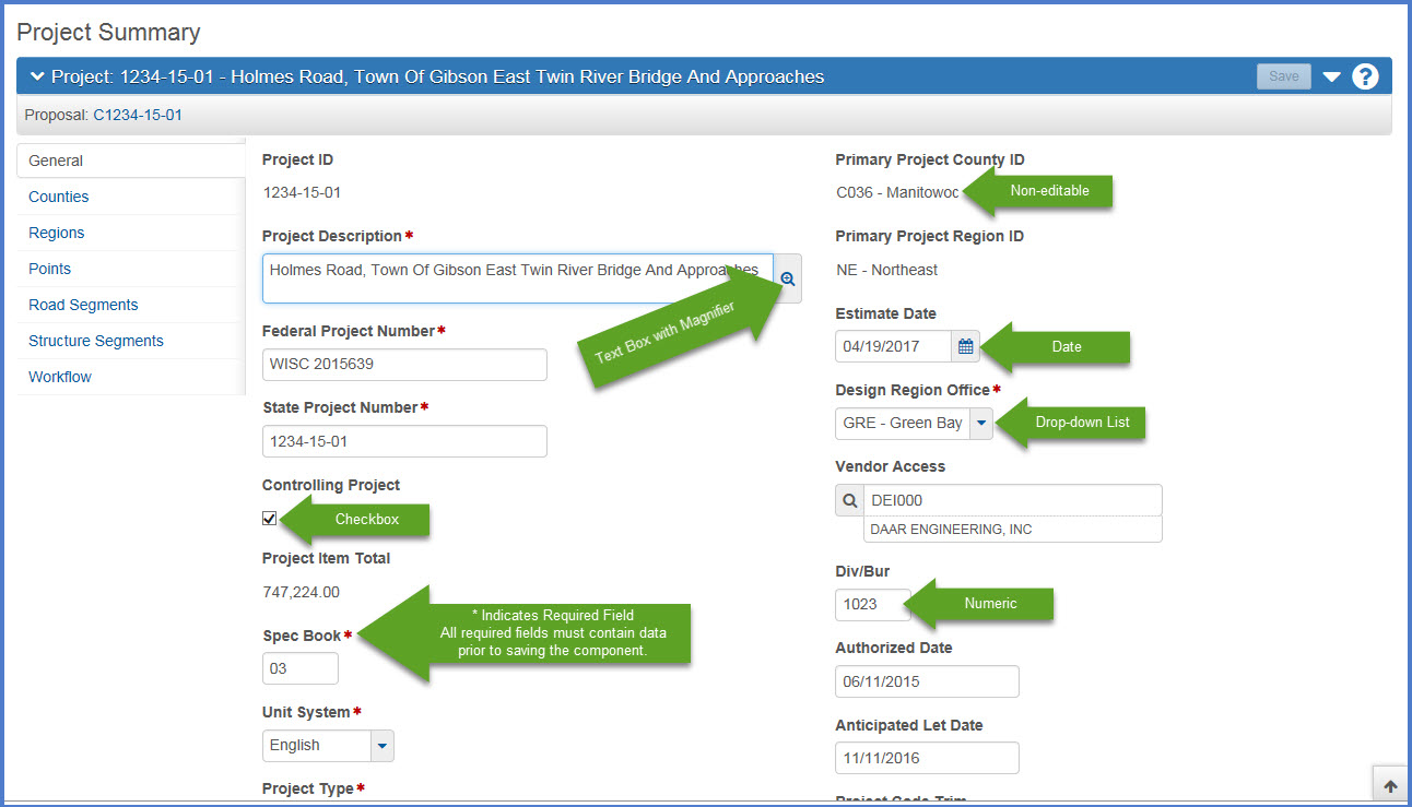
Fields are the most common element found on components. Information can be recorded and viewed in fields. You can move from one field to another by clicking <Tab>. The system has several different types of fields which are described below.
Working with Fields (total video time 00:05:05, updated 11/10/2017)
| Field | Description |
|---|---|
| Text Boxes | Directly type or delete information. |
| Numeric Fields | Allow only numeric characters. |
| Auto-complete Fields |
Similar to text boxes except that they display a filtered list of values based on the first few characters typed into the field. |
| Date Fields |
Include a calendar button next to the field. Click the <Calendar> button to display a calendar and select a date to populate the field. |
| Drop-down List Boxes |
Click the drop-down arrow next to the field to display a list of possible field values. |
| Non-editable Fields |
Display information without a text box. The information cannot be changed. |
| Checkboxes |
Square boxes that can be selected or cleared using the mouse. Checkboxes are used to turn an option on or off. |
| Tool Tips |
Hover over a field name and the associated tool tip with specific information about the field will appear. |
| Field Validation |
Hover over the data entry portion of a field, and specifics about the data to be entered will appear, including maximum number of characters or formatting. |